Why Websites Don’t Convert (Even When They Look Professional)
Why Websites Don’t Convert (Even When They Look Professional)

Most business owners are surprised when their website is flagged as part of the problem.
It looks professional.
It reflects the brand well.
It cost time and money to build.
So the assumption is:
“If the website looks good, it should work.”
But conversion doesn’t fail because a website looks bad.
It fails because the website doesn’t help someone make a decision.
Websites Are Usually Built as Brochures — Not Decision Systems
Most websites are designed to present information.
Pages explain:
What the business does
Services offered
Experience and credentials
Examples of work
All useful — but incomplete.
Because customers don’t visit websites to learn everything.
They visit websites to reduce uncertainty.
If a website doesn’t actively guide that process, visitors stall.
And stalled visitors don’t enquire.
Customers Aren’t Curious — They’re Cautious
This is one of the most misunderstood parts of online behaviour.
Business owners are curious when they browse:
They enjoy reading
They explore
They compare features
Customers are different.
They’re cautious.
They’re risk-aware.
They’re trying to avoid making the wrong choice.
So when a website:
Shows too many options
Explains too many things at once
Doesn’t clearly say what to do next
The customer doesn’t feel informed.
They feel unsure.
And uncertainty stops decisions.
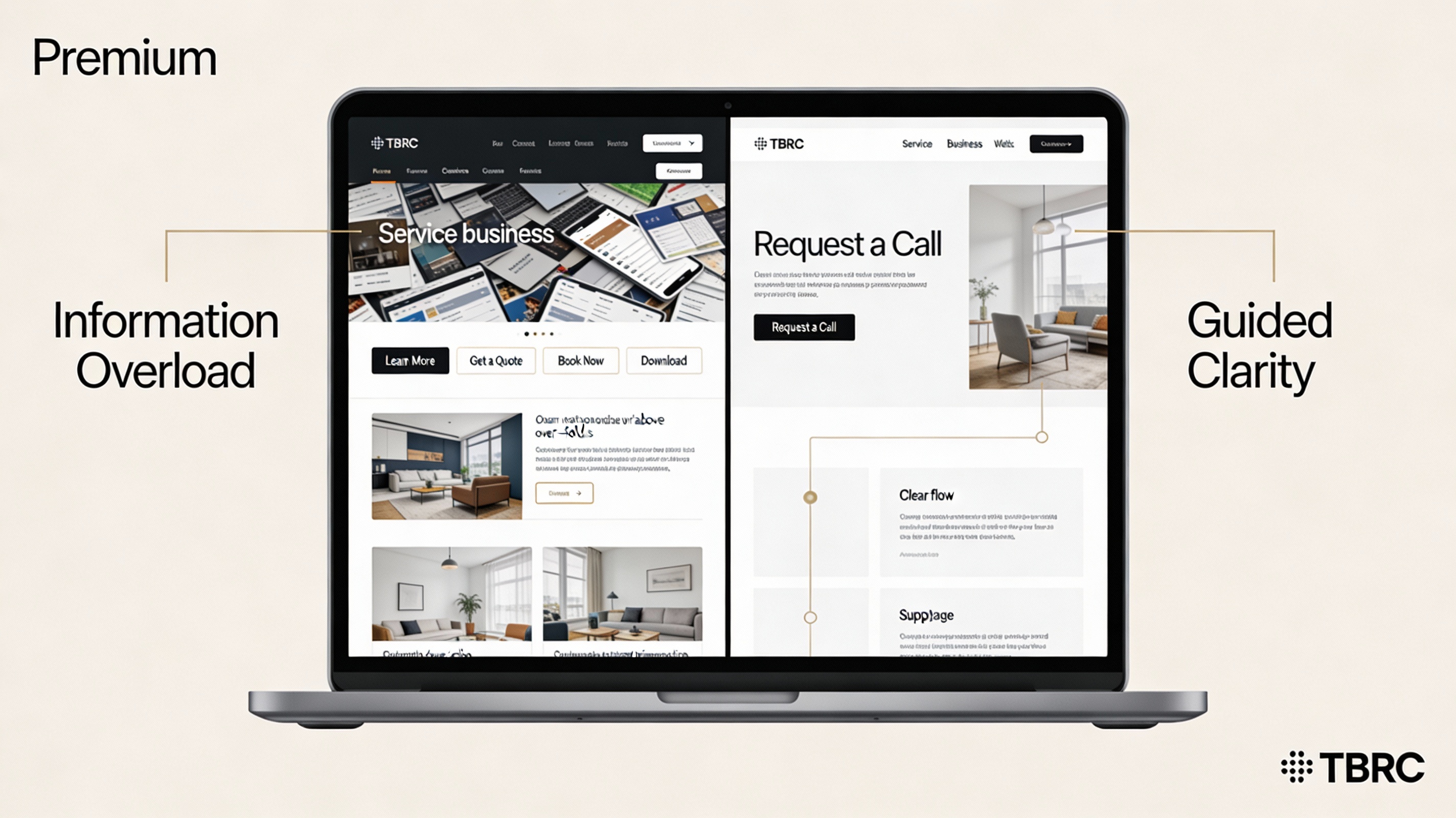
Why “More Information” Often Makes Things Worse
A common reaction to low conversion is to add more content.
More pages.
More detail.
More explanations.
But more information increases:
Cognitive load
Comparison fatigue
Decision anxiety
From the customer’s perspective, the question becomes:
“What am I supposed to do with all this?”
Good websites don’t answer every question.
They answer the right questions in the right order.
A Website’s Real Job
A converting website does three things exceptionally well:
Reassures quickly
“I’m in the right place.”Clarifies relevance
“This is for someone like me.”Guides the next step
“Here’s what to do next.”
If any one of those is missing, friction appears.
Not obvious friction.
Quiet friction.
The kind that shows up as:
Low enquiry rates
“We get traffic but no leads”
Interest without action
Why Professional Design Isn’t Enough
Design improves credibility.
It doesn’t replace clarity.
You can have:
Great branding
High-quality images
Well-written copy
And still lose enquiries if the decision path isn’t clear.
Because conversion is not about persuasion.
It’s about confidence.
And confidence comes from guidance, not presentation.
This Is Why Website Performance Feels Unpredictable
When a website isn’t structured to guide decisions:
Some visitors push through anyway
Others hesitate and leave
Results vary week to week
From the business side, this feels random.
In reality, it’s structural.
The website isn’t broken.
It’s just not doing the job it needs to do.
Seeing Website Problems Clearly (Without Guessing)
Most business owners only ever see their website from the inside.
What’s missing is the outside view:
Where hesitation begins
Where clarity drops
Where decisions are being avoided
That’s what the Website Visibility Reset is designed to reveal.
It looks at:
Decision flow
Message clarity
Calls to action
Where friction appears
No redesign pressure.
No tech jargon.
Just visibility.
